Visual enhancements to Main Menu
The Dayshape Main Menu has been refreshed for accessibility and a stronger brand identity. The Main Menu now uses Dayshape Dark Purple (from the official brand palette) and includes separator bars to isolate access to the main functional areas, from the separate Notifications and Help/Log out buttons.
To promote a stronger brand identity, the Dayshape logo has been added to the top of the Main Menu in both collapsed and expanded forms:
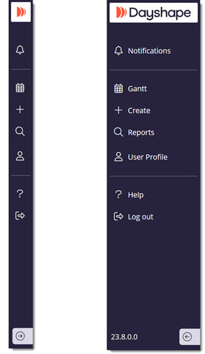
New look Main menu (expanded and collapsed)
Additionally, to simplify a users’ view, we have removed the grey overlay that used to indicate ‘time in the past’.